Color Coordination: Choosing Furniture To Match The Walls
August 25, 2020
Are you looking to create a cohesive and fun-looking new living room but don’t consider yourself an experienced decorator? One easy way to create a beautiful and unified space is to try color coordination. There are several different paint color trends that can help you create a warm, welcoming, or modern space, depending on which one best fits your personality and style. Read on to learn about three ways you can coordinate your living room to make it look great.
Neutral Is Always In Style
When people first hear the word “neutral” the first word that usually pops in their head right afterward is “boring”. Neutral colors aren’t just beige and brown. There are countless different natural, neutral shades of paint that can truly go with anything you put on the walls or decide to decorate your home with, making it a great jumping-off point. Plus, by painting your walls a neutral color, if you ever plan on selling your home, it will allow prospective buyers to view it as a blank slate for them to put their personal touch on.
Some ideas for neutral color trends include gray, white, and black. These colors are clean, modern, and most importantly, will work in any room.
Get Funky With Contrasting Colors
If you feel more adventurous and love a good pop of color that makes your home stand out, choosing contrasting colors of furniture and wall paint is a great option for you. When you look on the color wheel, contrasting colors that go well together are either placed directly across from one another, or side-by-side. This will help you come up with some inspiration for furniture and paint colors.
Some good examples of successful contrasting colors include blue with underlying green tones paired with red and orange tones, violet with yellow, or even yellow and orange. Of course, if you do decide to go with bold contrasting colors, be sure to choose ones that you love!
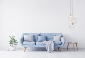
Monochromatic Scale
One of the most popular color coordination trends is the monochromatic scale. It’s sleek, modern, clean, and you can choose to be adventurous with colors that will pop, or create a more understated look with different shades of neutral tones, like grays and blacks. All you need to dedicate yourself to is one color, then choose furniture with varying shades of that color to match your walls. Before you know it, you’ll have a cohesive, beautiful home that you’ll feel glad inviting guests over to.
These three color coordination trends are a great place to start while you’re still in the planning stages of creating a space that’s truly yours. Further into the project, it’s important to consult professionals with questions about paint and colors, because they can offer you the most experienced and best opinions. Once your new living room is complete, you’ll be glad that you went with one of these impressive paint color trends!
About Platinum Painting of Dallas
At Platinum Painting of Dallas, our team of experienced professionals is completely bonded and insured and more than happy to offer advice and opinions throughout the process. We are dedicated to serving homeowners in North Texas and providing them with high-quality exterior and interior painting that will boost their curb appeal and create a space that they feel comfortable in. For questions or to schedule a free estimate, visit our website or call 214-347-7269.
No Comments
No comments yet.
RSS feed for comments on this post.
Sorry, the comment form is closed at this time.